
Responsive Web Design: Why It Matters in Today’s Mobile World
Introduction: The Mobile-First Reality
Ever tried browsing a non-responsive website on your phone? Chances are you zoomed, pinched, squinted—then left. You’re not alone. Over 58% of global website traffic now comes from mobile devices (Statista). In this mobile-first age, responsive web design isn’t just a trend—it’s a non-negotiable standard in modern website development.
As mobile usage continues to skyrocket, businesses must adapt. A website that seamlessly adjusts to different screen sizes not only ensures usability but also boosts engagement, SEO performance, and brand credibility.
Let’s dive into why responsive design matters more than ever and how it elevates your website development strategy.
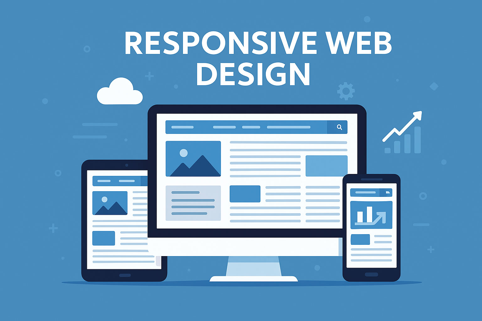
What Is Responsive Web Design?
Responsive web design (RWD) is a design approach where a website’s layout, images, and functionalities automatically adjust to fit any screen size—be it desktop, tablet, or smartphone.
Key characteristics include:
- Flexible grids and layouts
- Scalable images and media
- CSS media queries that control style rules based on device characteristics
RWD aims to provide users with a seamless and consistent experience, regardless of the device they use.
Mobile vs Desktop: A Clear Shift
To understand the importance of RWD in website development, consider how user behavior has changed:
| Device Type | Global Usage Share (2024) | Bounce Rate Impact |
|---|---|---|
| Mobile | 58% | Higher on non-responsive sites |
| Desktop | 39% | Lower when well-optimized |
| Tablet | 3% | Varies |
Conclusion? If your website isn’t optimized for mobile, you’re alienating over half your potential audience.
Why Responsive Design Matters in Website Development
1. Enhanced User Experience
Responsive websites offer a better user journey:
- No zooming or horizontal scrolling
- Intuitive navigation
- Faster loading on mobile networks
Positive user experience = longer time on site + higher conversion rates.
“Users who have a negative mobile experience are 62% less likely to make a future purchase.” — Google Mobile Playbook
2. Improved SEO Rankings
Google’s algorithm now prioritizes mobile-first indexing. That means the mobile version of your website is the one Google uses for ranking and indexing.
Benefits of responsive design for SEO:
- One URL per page (vs. separate mobile/desktop versions)
- Easier crawling and indexing
- Lower bounce rates (a ranking factor)
Learn more about mobile-first indexing.
3. Faster Website Performance
Speed is crucial. According to Google, 53% of mobile users abandon a site if it takes longer than 3 seconds to load.
Responsive websites:
- Optimize image sizes
- Minimize code bloat
- Reduce server requests for mobile devices
4. Cost-Effective Maintenance
Instead of building separate sites for desktop and mobile:
- One responsive site = lower development and maintenance costs
- Simplified analytics, reporting, and updates
Personal note: “When managing client websites, I’ve seen time and again how responsive design reduces long-term headaches for both developers and clients.”
5. Better Social Sharing and Engagement
Content shared on social platforms is mostly accessed via smartphones. A non-responsive page opens awkwardly and breaks layout on mobile screens—killing the engagement potential.
With RWD:
- Shared links look great across all devices
- Users stay longer
- Higher chances of engagement and conversions
Common Responsive Design Pitfalls to Avoid
Even with the best intentions, many developers make mistakes:
❌ Overloading with Content
Too much content squeezed into small screens creates clutter. Prioritize readability and essential elements.
❌ Ignoring Touch Navigation
Make sure buttons are easy to tap, and navigation doesn’t rely on hover effects only.
❌ Poor Image Optimization
Large, uncompressed images slow down load time on mobile. Use responsive image formats and lazy loading.
Best Practices for Responsive Website Development
✅ Use Fluid Grid Layouts
Build layouts that scale proportionally, not based on fixed pixels.
✅ Implement CSS Media Queries
Tailor styles for different devices using media queries like:
@media (max-width: 768px) {
  nav {
    display: block;
  }
}
✅ Optimize Navigation
Use mobile-friendly navigation like hamburger menus and sticky headers.
✅ Test Across Real Devices
Tools like BrowserStack or Responsively App help you test how your site appears on multiple screen sizes.
✅ Prioritize Core Web Vitals
Responsive design also means optimizing for metrics like:
- Largest Contentful Paint (LCP)
- First Input Delay (FID)
- Cumulative Layout Shift (CLS)
Check performance using PageSpeed Insights.
Real-World Success Story: Airbnb
Airbnb’s team implemented responsive design early on. As a result:
- Mobile traffic grew by over 30%
- Booking conversions increased on smartphones
- Maintenance time was halved by consolidating into a single codebase
Their mobile-first philosophy paid off with smoother UX and stronger SEO performance.
Final Thoughts: The Future Is Fluid
In today’s digital ecosystem, responsive web design is no longer optional—it’s foundational to effective website development. It boosts your SEO, delights your users, and helps your business grow in a world dominated by smartphones.
By embracing mobile-first principles, optimizing performance, and focusing on the user experience, you position your brand for long-term digital success.
💬 Ready to Build a Responsive Website?
If you’re planning a new project or revamping an old site, responsive design should lead your strategy. Need help? Explore our website development services or contact us for a free consultation.
Don’t forget to share this article with others building a mobile-friendly web presence!